The use of the hand once again in drawing stop motion is something i am very interested in and would like to explore. It adds another thing to play around with rather than just drawing changes and recording them. It is a third element that can be taken into consideration and why does it just have to stop at the hand? A story is told of the characters day as well even though no text narrative or scene is set out at the start. It seems as long as the animation flows from one scene to the other and a correlation is kept then it can be believed and understood without any prior knowledge or explanation.
In this film not only does the hand interact with the images but the images also interact with themselves and change shapes within themselves. This is not believable and the story it shows is random and in certain places could be considered irrelevant. Yet because it fits with the music and relates to it the uniqueness and random qualities of the animation are observed and enjoyed rather than questioned. Colour is also introduced and this is something i am going to have to think of.
Kristofer Strom is a musician and animation illustrator from Sweden. He was reletively unknown until he started uploading his whiteboard works onto youtube and quickly gained a large fan base. He joined Blinkink productions and has now done works proffesionally for companies such as Carphone Wharehouse. I am a fan of his work as he is able to not only create narratives and image based stories out of nothing but he can also place these into other scenarios like his minilouge of animals. The characters he uses are made up or exaggerated and the use of colour and shapes he uses really interests me.
The way he manages to make a normal scene into a surreal and fantasy world in time with the music is down to imagination and being able to portray that with your drawings. Although made up characters are used and it is obviously not real, due to the movement in the animation we can believe it. Therefore when doing my final piece i do not have to restrict myself with making my video out of things that exist and can make up new things if i am required to.
Done on what i believe is a whiteboard this drawing stop animation does not just show the changes in drawings but also him creating and in some instances rubbing them out. This effect is taken further by showing his hands interacting with the drawings and is made to seem like they are changing what we see. Again if it fits with the story being expressed then there is nothing to say why one cant think outside of the box and include these things.
I really like how made up characters clearly designed to be seen as this and nothing more by using bold flat colours and exaggerated shapes, are put not just into a photo of a real scene but a video of one. Quirky little things like putting a small whale into a canal are comical but do fit and as unbelievable as they are you can imagine it happening. Repetition is used in many instances with the different characters movements. This not only saves time creating it but also fits the beat of the song.
After i was given the brief i immediately looked into finding animations that were designed for a piece of music and used techniques such as stop motion that i would be doing in my later workshops. As i had not done any workshops yet and was unfamiliar with my music track i choose songs and videos i personally liked and could write about.
A video that sprung to mind straight away was Benga's - Baltimore Clap music video by Kristofer Strom. I came across this one day when i forgot to take my ipod to the library and used youtube to listen to songs instead. I liked how it was a short film produced to fit alongside the music (what i will be doing) and how inventive and unique it was. It was created using stop motion and uses simple characters and repetition which i may have to copy as this greatly reduced the workload. It however does not make any difference to the video and is a great minimalistic, short, snappy and to the point animation, which still managers to deliver the narrative.
This video is another personal faviroute and although no description is given and there are no lyrics in the song you should be able to get the simple concept that the yellows fight the reds and in the end destroy themselves. Although many underlieing ideas and messages can be taken from the video by use of clever imagery and timing i wont talk about these as there are to many and it does not support my project. I would love to do something this complicated with such an outcome but i dont have the time nor the skills required yet to undertake it.
Whilst looking at the first two videos this one was suggested, it is a stop motion piece created by a youtube user. It is not of the same quality as the other two proffesionally done pieces and the frame rate looks lower meaning the quality is a bit jumpy however the motion is still captured and the idea portrayed. I imagine this is something similar to what i will be producing.
Stop motion is again used in this video but it is not of drawn or digital images but of a 3D character moved into position and then the shot taken. Although the model has to be created and moved with care it does mean multiple camera angels can be used and the repetitive and i imagine boring process of drawing similar images over and over does not have to be done.
For Herve's new song Together a comical video was made and although unsubtle and in places very rough movement is created within still pictures. Although it is a "funny" animation and there is no real narrative the clip does fit the audio track. This is something i could take into consideration when planning my final piece.
The main points i rasied when thinking about the final design where:
Consistency within text. Including the GF Smith Paper logo. Keeping it minimal and about the layout. Making sure the information and type was easily distinguishable and emboldened from the background.
The information to be included was; 100 Years of GF Smith Paper
Design Museum
01 - 31 July 2011
The two red crosses weere cut out and pleated for the poster. They had to be made larger horizontal to the direction of the pleate than they needed to be as doing this to them made them smaller in length.
After placing these to one side the offcuts that were saved were used to create a template on the white underlay. Only markers on the edges where used as the underlay had to be half an inch wider then the red crosses. Once the new lines where planned out the white underlay was cut out and placed on the blue background sheet.
Before adding to the underlay and background the pleates were checked and stretched to the appropriate sizes. All that needed to be done now was to place them onto background. They were not stuck down as i wanted to be able to play about with the layout and change it if needed.
GF Smith Paper is a privately run company from Hull, England who have been around for over 100 years. They develop and manufacture paper for various applications such as printing and specalist graphics papers. They are renowned worldwide and are very proud to be British and not owned by a larger company. Below is their logo.
I also looked into some posters/artwork that have been created for/by them. They are all very minimalistic and to the point. The text describes exactly what the poster is about and says nothing else. They are bold and do not use colour other than to highlight certain areas of intrest. It is almost as if the layout and information portrayed is more important than the design and imagery of the posters.
Already even from 3 examples i am seeing the fact that they are British is clearly a major issue for them and whether done by text or image/layout it is something that i should definately consider including if not doing my design about. Text is also a large part of the design whether by using a large font or not i need to make sure the information given in the brief is clearly visible and stands out from the background. The text used is also a varient of Helvetica i believe to be Neue Helvetica. Whether i use this or not is yet to be decided although if it does fit in with my final design i should definately try it as companys, especially independant ones are better recognised by consistency. Adding their logo is also something i should consider and take into account.
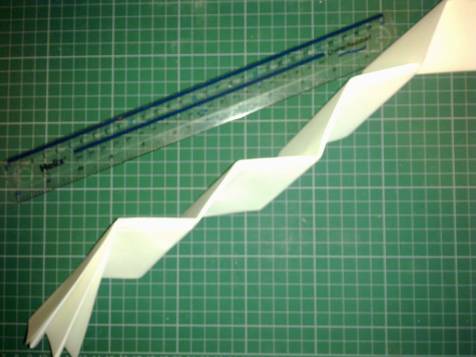
First of all apolagies for the bad quality of the images as they had to be taken at home for them to be printed out. I have tried to show the various folds within the piece and the way it has been manipulated to create these. The lighting wasnt great and in some cases the true effect is not fully visible but i believe you can still see the folds and twists within the paper and although not enhanced they are certainly visible. I am happy with the final piece although i would have preffered to proffesionally document it with the right equipment and location. Hanging it up was also a problem as the thread i had purchased unfortunately wasnt strong enough and therefore it had to be selotaped on which in some images is clear to see. However the curves, twists and bends (flexibility) i had wanted to create were managed and have been photographed meaning my final piece met the criteria i set it. In relation to a snake if the stereotypical tongue and eyes were added then i do believe it would be easily recognisable as it is a long and flexible form with repeating scale like folds.
The folding technique i used in early workshops was on a lesser quality (thickness) of paper and not on a large a scale. This meant the folding was harder and in some cases needed to be scored in order to achieve the same outcome. The paper was first pleated along the lenght of the sheet. The length depended on how flexible i wanted it (the shorter the less flexible it was) and the width was kept at just under 12 inches allowing the same thickness and size of folds along the design.
After being pleated the paper was collected together and from the top was folded over to create a right angle and a triangular style shape at the top. This was repeated but folded the opposite way down the length of the paper until you got to a stage shown in the image above where no more folds could be made. These were then folded over on themselves and if needed scored so that the fold was flexible and could move in either direction.
This was then flattened out into what would become a flat sheet of paper again, however the folds and scores are clearly visible and serve as guidelines for the structure.
Along the width of the sheet via the zig zag lines, they were allternatly raised up or pushed down. This in turn with the a-joining length lines would start to create the basic structure and folds of the final piece.
After these had been strengthened by comacting together and the folds being made more rigid by pressure the ends were cut off as shown above at one end enabling the different sheets to be attached together shown below. I originally just used glue to attach them however due to the flexible nature of the final structure and also to my suprise its weight glue was not enough and selotape had to be added aswell. Staples were not an option as it did need some flexibility and certain areas were not accesible with one.
After playing about with the folding technique i found that if long thin sheets where constructed (coincidently the same properties as a snake) then it does become flexible and can be manipulated in a manner of ways. However if a long thin sheet is made by attaching mutliple shorter ones then it still retains the rigidity of them individually and when attempting to manipulate it, it would often warp out of the pattern or the pieces would come apart from each other.
I have selected the video below as it shows the movement and flexibility of snakes. If i am going to base my final model on them then i need it to also have these properties. The paper is flexible but only if done over a large area as the solid straight edges give the otherwise flimsy paper rigidity and strength. The model is also more likely to bend against the direction of the points rather than with them, and as i have found it is harder to create a larger piece like that whether by defualt or attaching seperate sheets together.
With the scales of the snake also visible in parts of the video it is also clear that this would also not be a good representation of one although it would still be a repeating pattern.
After linking one of my faviroute models to a primary subject i am going to explore it more and see what other ways i can visualy represent it and if there are any modifications i can make to the original.
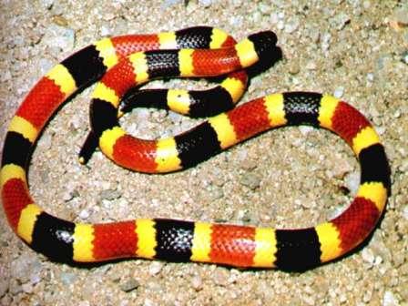
Whilst looking for other examples of repetition within nature i found this image. I have not looked at living things yet other than with parts of the human body so it may be another direction to try? However this particular image of a snake reminded me of an earlier piece i had done.
In this example Richard Sweeney has used objects from nature i.e. flowers and shells to form a collection of objects that have repetative geometry and use curves. Although relating to my work i have done so far i found using multiple curved lines/pieces of paper and making them work tricky especially when the structure was done in a smaller scale.
However i am a fan of the pleated techniques he has used in some of these and the way he managed to created a curved surface through using straight edges.
Organic shapes and structures can also be found on a smaller scale when looking at ourselves and nature close up. I have for example already made something that resembles a DNA strand in a workshop.
DNA strands could be made in 2D or 3D form and it is something i definately would like to explore. The shape could be manipulated and hung in different ways as there are different strands of DNA and different ways to represent it. Some like the example shown could possibly be hung and would move altho as i am photographing my model this is not something i would need to take into consideration.
With adhesives and some exploration of other paper folding techniques i believe that this shape or one similar to it would be possible. Spirals are something i would like to explore aswell as i havent yet.


